This page looks better in the app
You’re a web developer at a social media company that has recently made a big push for modernizing their frontend for the mobile-first era. It has taken a lot of time and effort from many people. Countless challenges, arguments, testing.
The release is near. You’re probably a bit anxious. After all, the site is visited by millions of users every day. What if something breaks? Will the users like the redesign?
It’s live.
You navigate to the site on your phone.

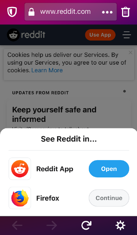
Okay, it’s recommending the app. That’s fine though, you still have the option of using reddit in the browser.
You refresh the page.

I can’t imagine what the web developer who had to implement this was feeling.
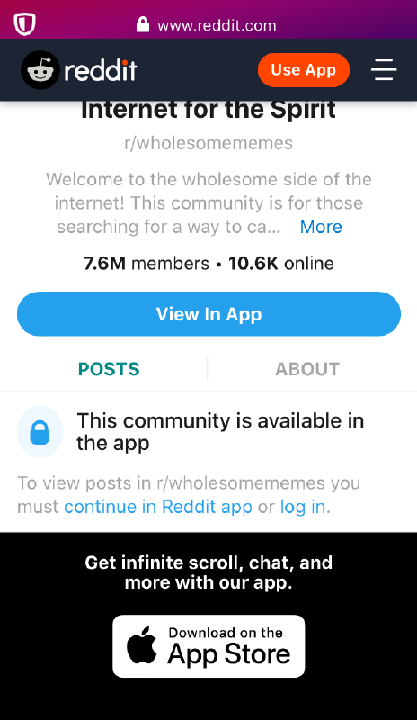
To add insult to injury, this is what happens when you try to navigate to a subreddit on the mobile site:

There is a workaround to this: navigate to the subreddit from Google and you will be fine, as long as you don’t navigate elsewhere.
Why even bother with developing the website if all it does is advertise the app everywhere?
Subscribe to new posts via the RSS feed.
Not sure what RSS is, or how to get started? Check this guide!
You can reach me via e-mail or LinkedIn.
If you liked this post, consider sharing it!